Vicks
Vick Humidifier line
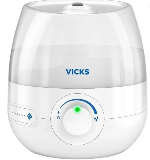
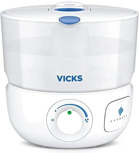
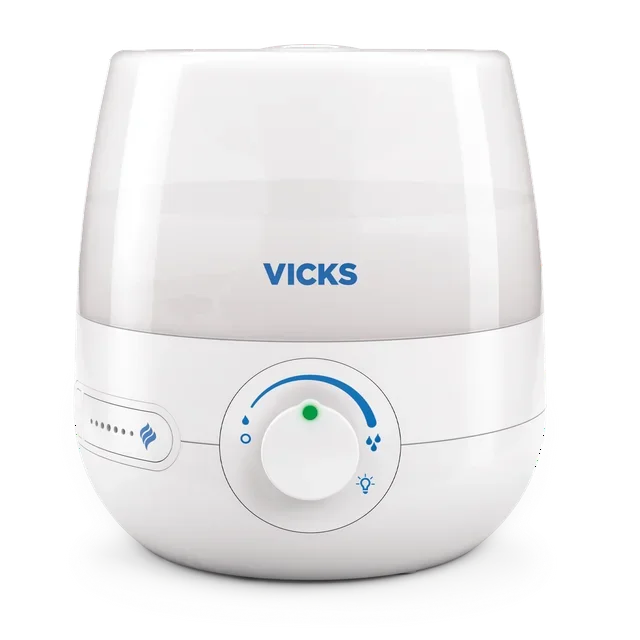
Vicks is a brand built on trust — a household name synonymous with care and relief. Yet its line of humidifiers had drifted from that equity, presenting as a fragmented collection rather than a considered product family. The challenge was to restore that sense of confidence and cohesion, redesigning the range to feel as reliable and unified as the brand it represents.
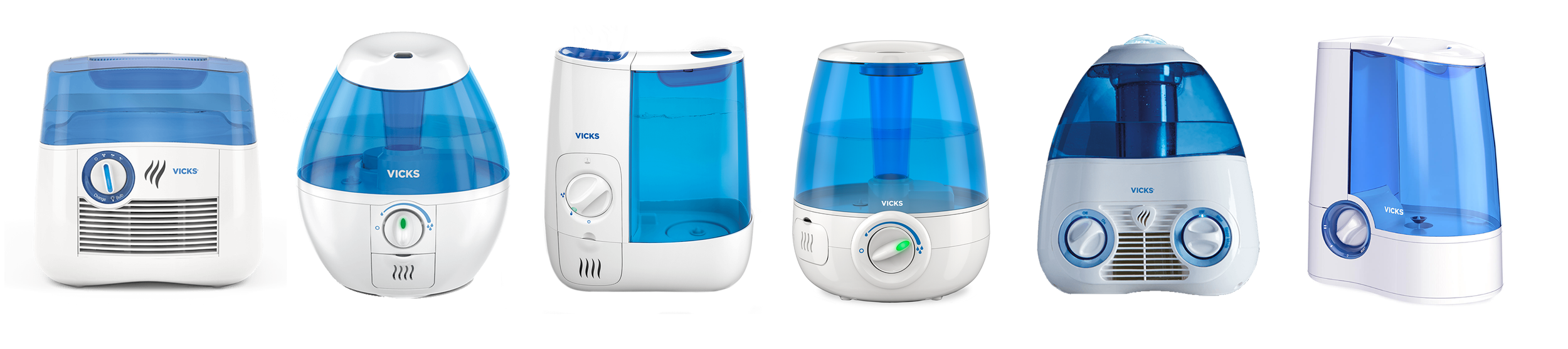
The existing product range had grown visually fragmented over time — inconsistent colour application, misaligned design details, and brand iconography applied without a cohesive system or intent. The line lacked the coherence needed to communicate a unified brand identity.
The design brief was clear: bring coherence to a range that had lost its voice. We began by establishing a shared design language across the entire Vicks humidifier line — standardising colour, logo placement, and key visual details to create a system that felt intentional from every angle. Smooth, rounded forms and a refined modern aesthetic were adopted consistently across all models, ensuring that every product in the range reinforces the brand rather than diluting it.